Why AI Colorization in 2026 Feels Trustworthy (and Fast)
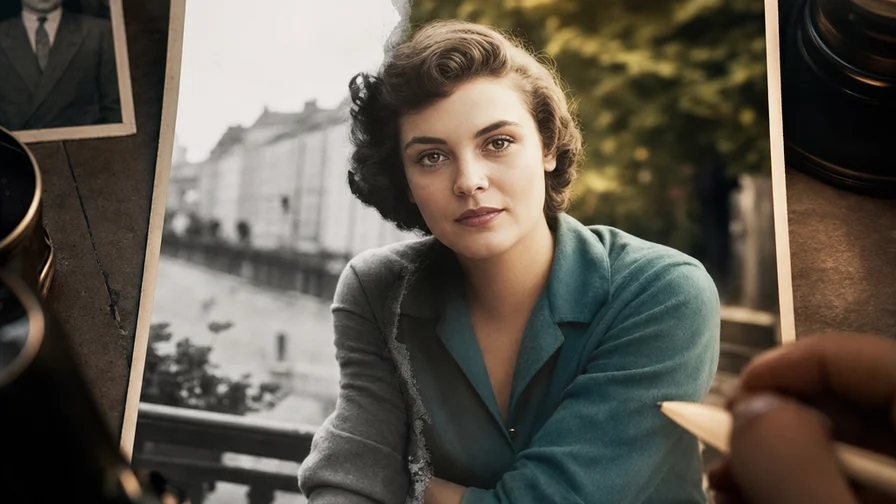
Old-school colorization was a grind. Masks, layers, lots of guesswork. You’d nudge hues for hours, only to end up with waxy skin and flat skies. Modern AI—specifically instruction-following image editors—cuts through that. Models like Nano Banana on Nexvy read what’s in the frame, infer skin tone ranges from facial structure and lighting, and draw on learned priors to suggest era-appropriate palettes. You tell it what to do in plain language. It listens.
That instruction-following piece is the leap. Instead of pushing sliders blindly, you can say: “Colorize with natural 1940s tones, fix dust and scratches, keep original film grain, do not oversaturate.” The model parses the scene (faces, uniforms, signage, foliage, sky, water) and applies different color strategies to each region. It also respects photographic cues—overcast light reduces contrast; indoor tungsten makes whites warmer; orthochromatic film lifts blues and crushes reds. The output tends to breathe, not shout.
Another difference: restoration and color happen together. Nano Banana isn’t just adding color. It can fill hairline cracks, blend tape seams, and de-emphasize dust specks without plastic-smoothing your relatives. And because it’s built for editing (not just generating from scratch), it preserves structure—cheek textures, jacket stitching, paper grain. On Nexvy, you can push a single instruction and get color, repair, and an upscaled variant in one pass.
Is it perfect? No. Extremely degraded prints or ambiguous historical uniforms can still trip it up. But compared to meandering manual workflows, today’s AI editors give you two hard wins: speed and consistency. One set of instructions colorizes an entire album with the same temperament—no weird outliers three pages in. If you’re restoring a family archive, that consistency matters.
Step-by-Step: Colorize a Photo on Nexvy with Nano Banana
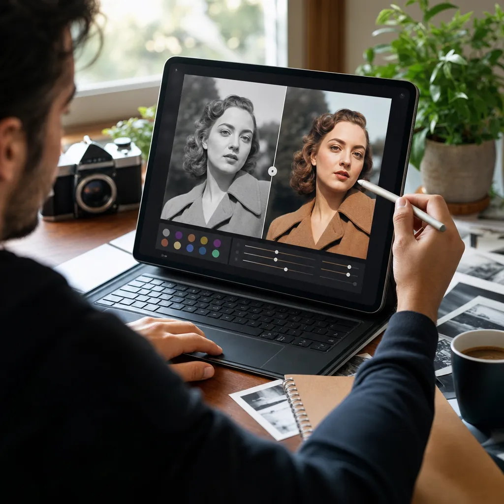
Before you upload: scan well
- Scan at 600 dpi if possible. A phone photo works in a pinch, but a flatbed scan avoids lens warping and glare.
- Capture the entire border. The model uses edges and paper tone as context.
- Don’t pre-sharpen or boost contrast aggressively. Let the AI handle tonal recovery.
1) Open the editor and upload your black-and-white image
Log in to Nexvy (Free plan includes 400 credits; no subscription required). Go to Images → Editors, and choose Nano Banana. Drag in your scan. You’ll see a simple prompt box and options for output size and variations.
2) Choose your model: Nano Banana or Nano Banana Pro
- Nano Banana (60 credits per photo): Fast, faithful, and ideal for most colorizations and light repairs.
- Nano Banana Pro (higher credit cost): Slower but sharper on pores, hair, embroidery, and micro-contrast. Useful for portraits and prints with fine halftone detail.
3) Start with a strong base prompt
Paste this as your first run. It’s a reliable general recipe:
“Colorize this black and white photograph with realistic, era-appropriate colors. Preserve all facial details and original film grain. Remove scratches, dust, and crease lines. Keep saturation natural and avoid orange skin tones. Slightly increase resolution while retaining authenticity.”
Why it works: it sets color goals, protects texture, requests repairs, and constrains saturation. It also names common color pitfalls (orange skin, over-bleached whites).
4) Set output and run
- Output size: 2× is usually enough. Pushing 4× can exaggerate film grain on tiny originals; inspect at 100%.
- Variations: Ask for 2–3 variations if the photo includes uniforms, signage, or painted objects with unknown colors.
- Hit Generate. Review side-by-side before committing to a final download.
5) Make a quick second pass when needed
- If faces skew too warm, run the same image with: “Keep skin tones neutral with lifelike undertones; reduce saturation by 15%; preserve lip detail.”
- If edges still show tears: “Further inpaint paper tears and blend borders seamlessly, keep all facial and fabric detail intact.”
- For portraits, switch to Nano Banana Pro for a face-detail pass. Instruct: “Refine facial micro-texture and hair strands without smoothing, match prior colors.”
Prompt Recipes for Common Photo Types
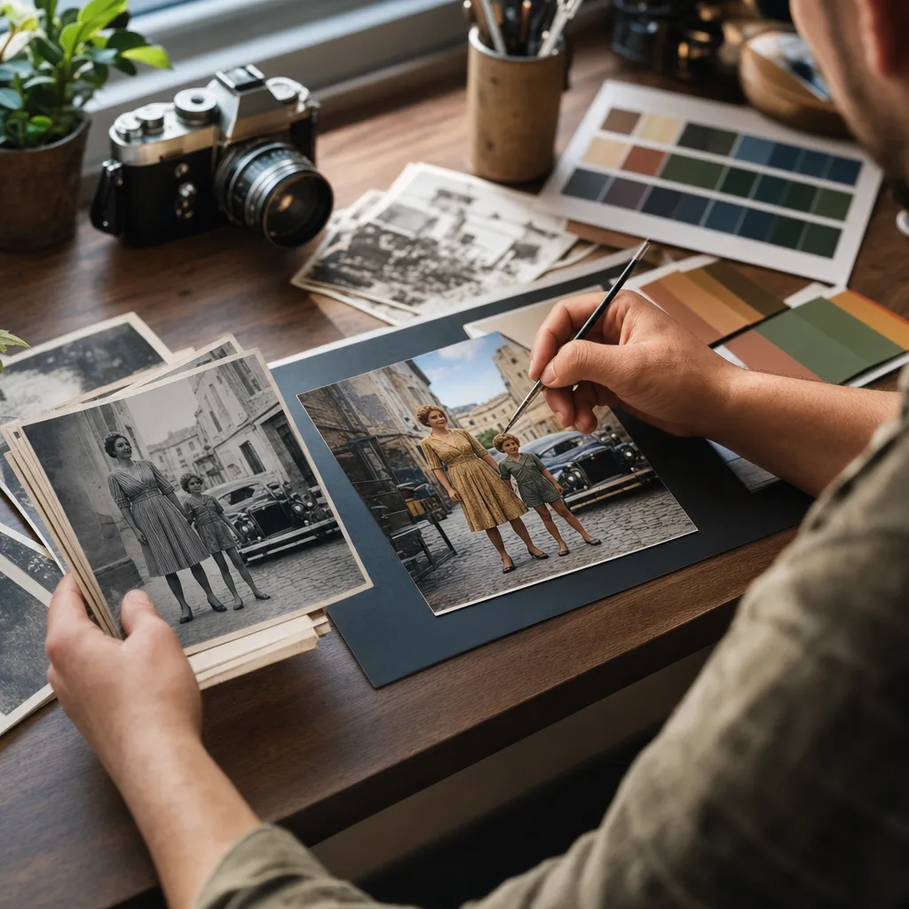
Copy, tweak, and run. Add dates or places when you know them; context nudges the palette.
- Family portraits (1930s–1960s)
“Colorize with subtle mid-century tones suitable for indoor studio lighting. Keep skin undertones balanced and natural, preserve freckles and fine wrinkles. Neutralize yellow paper tint, keep film grain. Remove dust, scratches, and silvering near dark jackets. Avoid overly red lips and keep hair tones realistic for the era.” - Wartime photos (WWI–WWII)
“Apply historically plausible uniform colors for [nation, year if known]. Keep canvas and wool textures crisp. Desaturate background rubble and smoke; keep skin tones realistic under harsh light. Preserve insignia clarity; do not invent missing badges. Reduce scratches and fold lines without plastic smoothing.” - City street scenes (1920s–1950s)
“Natural colorization with period-accurate storefront paints and signage. Keep asphalt and brick tones grounded; avoid neon saturation. Sky slightly muted unless strong sunlight is evident. Maintain reflections in shop windows, remove dust and small creases.” - Wedding photos
“Colorize with soft, elegant tones. Keep dress fabrics accurate (satin, lace) with subtle sheen; avoid blue cast in whites. Natural skin with gentle highlights; maintain bouquet greens and florals without oversaturation. Retain film grain and fine veil details; remove surface scratches.” - Documents and keepsakes (certificates, postcards)
“Restore aged paper to neutral off‑white while preserving authentic texture and stamps. Keep inks legible and do not invent missing letters. Colorize hand‑tinted areas conservatively. Remove coffee stains and tape marks where possible without erasing authentic creases.”
Want a period lean? Add anchors like “late-1940s Kodachrome temperament,” or “early-1930s muted dyes.” The model won’t mimic a film stock perfectly, but it steers toward warmer reds for Kodachrome-era looks and more tempered palettes for pre-war emulsions.
Advanced Control: Nailing Specific Colors and Fixing Artifacts
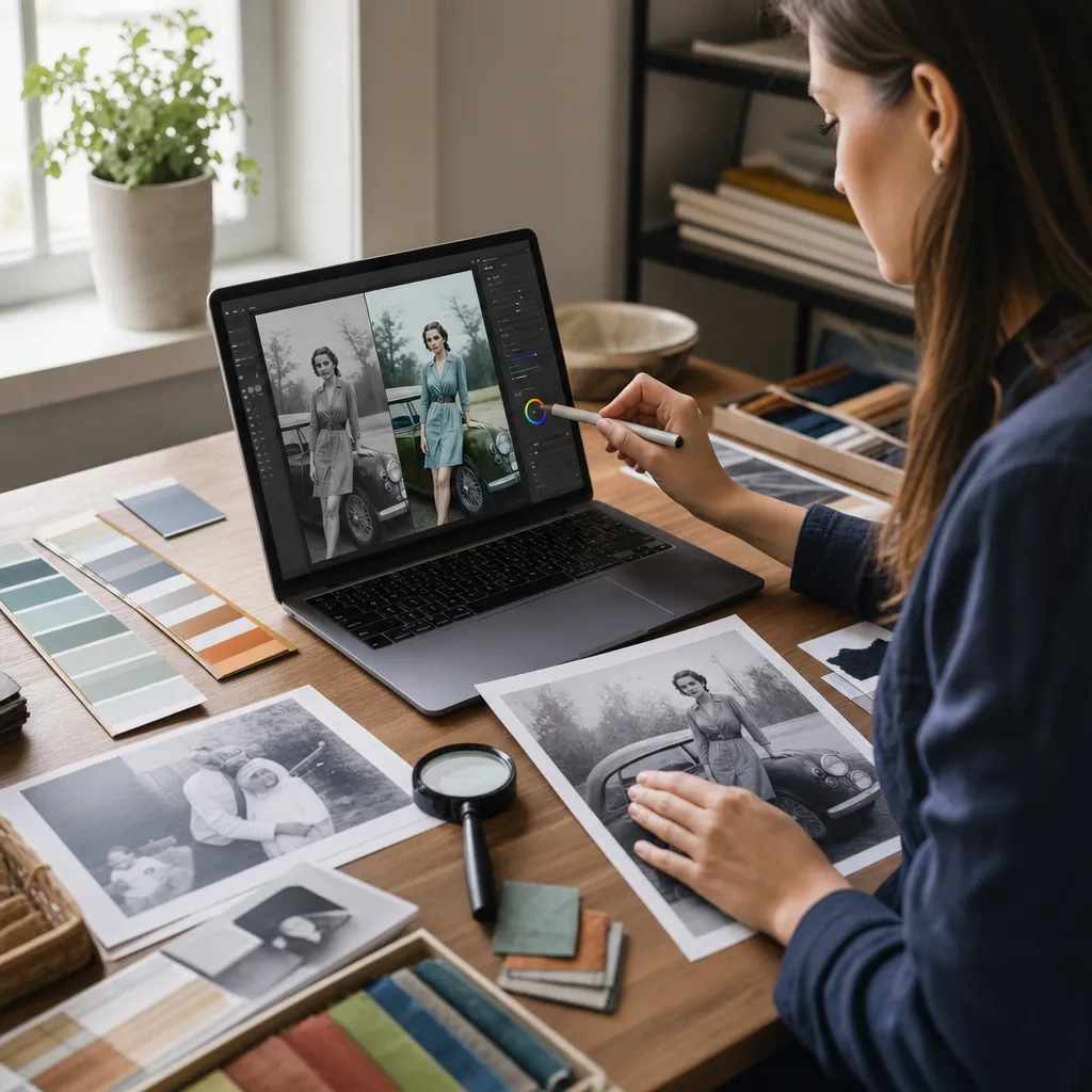
Tell it the exact color you remember
- Direct color notes: “The dress was navy blue,” “Grandfather’s truck was forest green,” “The front door was barn red.” Concise, object-first instructions help: “Color the tie deep burgundy; suit charcoal; shirt crisp white.”
- Use visual anchors: If you have a color reference (e.g., a modern photo of the same heirloom ring), upload it as a second image in the editor (reference slot) and add: “Match ring gold tone to reference image.”
- Hex language when useful: You can hint ranges: “Use a navy around #1b2a44 for the coat.” Don’t expect perfect hex matching under varied lighting; it’s a nudge, not a contract.
Control saturation and contrast without wrecking texture
- If the output shouts, re-run with: “Lower global saturation slightly; keep skin tones lifelike and avoid flatness; maintain micro-contrast in fabric.”
- For flat indoor shots, ask: “Gently raise midtone contrast; avoid clipping highlights; keep candlelight warmth subtle.”
- To keep grain: “Preserve original grain and paper texture; avoid plastic smoothing on faces.”
Do a targeted second pass for faces
- After a good global color pass, run a second pass emphasizing faces: “Refine facial features (eyes, lashes, lip texture) without changing prior colors; maintain pores and fine lines.”
- If the mouth turned too red: “Reduce lip saturation slightly; keep natural pink tones.”
- When hair looks painted: “Increase strand separation and specular highlights in hair; preserve original color mapping.”
Keep captions and signage honest
- For storefronts and posters: “Improve legibility without inventing missing letters; keep original typeface edges.”
- For medals and insignia: “Clarify edges of existing insignia; do not synthesize new decorations.”
Restoration Reality Check: What AI Can and Can’t Recover
Nano Banana is excellent at cosmetic fixes—scratches, dust, crease smoothing, gentle deblurring. It can also fill small missing patches of background (sky, brick, fabric) plausibly. Colorization often hides mild paper staining because tones have more room to blend. But there are limits:
- Severe tears through key features: If a rip crosses an eye or mouth, the model may “guess” anatomy. It can look convincing but historically inexact. Keep a copy of the untouched scan for archive accuracy.
- Missing corners with critical content: If the missing area includes faces, signage dates, or insignia, the model can’t truthfully restore what isn’t there. You can ask for “plausible fill” for framing, but treat it as illustrative, not documentary.
- Heavily blurred originals: Color can’t invent sharpness. You can add: “Gently improve edge clarity; avoid halo artifacts,” but pushing beyond the negative’s detail ceiling creates crunchy edges.
- Hand-tint overlays: Some old photos already have faint tints. Tell the model to preserve them if desired: “Respect existing hand tint as base; refine and harmonize, do not overwrite entirely.”
Honesty matters. If the color of a uniform ribbon or storefront sign is unknown, add that to the caption when you share the restored image. The point is to bring the photo to life, not to rewrite history. On large family projects, consider keeping a contact sheet of the original grayscale scans beside the colorized set.
Before/After Showcase: How to Present Results (5 Realistic Scenarios)
1) 1940s studio portrait
- Source: 5×7 print, light creases, slightly silvered shadows.
- Prompt: “Colorize with late-1940s studio tones, neutral indoor lighting. Preserve skin texture and grain; remove dust and silvering. Keep suit charcoal, tie deep burgundy, shirt crisp white.”
- Notes: Second pass to reduce lip saturation. Minor inpaint on jacket seam.
- What to look for: Natural cheek tones, not orange; realistic sheen on hair without plastic gloss; paper texture intact.
2) WWII group photo outdoors
- Source: 8×10 with fold down the middle; uniforms uncertain.
- Prompt: “Historically plausible [nation/year]-appropriate uniform colors; keep wool texture and metal insignia clear; desaturate background; remove fold and surface scratches; maintain authenticity.”
- Notes: Generated 3 variations. Chose the set with cooler greens to match location foliage.
- What to look for: No invented decorations; skin tones consistent across faces in mixed light; crease line blended without smearing badges.
3) 1950s city street
- Source: Contact print; cars, storefronts, pedestrians.
- Prompt: “Natural period color for signage and shopfronts; tempered saturation; keep chrome highlights on cars; retain film grain; clean dust.”
- Notes: Added: “Avoid neon hues; brick slightly warm.”
- What to look for: Balanced reds in signage, blue sky not electric, asphalt not jet-black; reflections in windows preserved.
4) Wedding portrait with lace veil
- Source: Slightly faded print, soft focus.
- Prompt: “Soft, elegant palette; preserve lace micro-pattern; whites clean without blue cast; bouquet realistic; remove hairline scratches.”
- Notes: Second pass on face texture using Nano Banana Pro to refine eyelashes and lip micro-contrast.
- What to look for: Lace pattern intact, no plastic skin; veil translucency still visible; flowers nuanced but not cartoon-bright.
5) Postcard certificate (keepsake)
- Source: Discolored paper, torn corner, handwritten notes.
- Prompt: “Restore paper to neutral off-white, preserve texture; keep ink and pencil strokes crisp; fill missing corner plausibly without fabricating text; remove tape residue.”
- Notes: Marked the reconstructed corner as illustrative in caption.
- What to look for: Ink edges not smeared, natural paper fiber still visible, corner fill not misrepresenting content.
Start Colorizing: Practical Tips and a Simple CTA
A few closing pointers help most projects land on the first try:
- Be specific in short sentences. “Coat navy, tie burgundy, shirt white” beats a paragraph of adjectives.
- Use variations when color is unknown. Pick the most plausible, not the flashiest.
- Keep the grain. It’s the soul of the print. Ask to preserve it explicitly.
- Document uncertainties. Add captions like “Approximate storefront colors.” It shows respect for the record.
Nexvy unifies 30+ creative and editing models—so when you want stylized re-imaginings you can reach for FLUX or Midjourney, or ideation with GPT Image 2 and Ideogram, while Nano Banana and Nano Banana Pro handle faithful restoration. For most colorizations, start with Nano Banana at 60 credits per photo. The Free plan includes 400 credits and doesn’t lock you into a subscription, so you can test an album before committing. If a few portraits deserve extra polish, re-run just those with Nano Banana Pro for micro-texture refinement.
Ready to see your family archive breathe again? Upload a scan, paste the base prompt, and let the editor do the patient work. Then spend your time on the part only you can do—naming the faces, telling the stories, and choosing which colors you know are right. Try your first set on nexvy.ai.